In today’s digital-first world, it’s easy to assume that print is fading into the background. But the truth is, print continues to be one of the most powerful tools for influencing customer perception and behavior. Why? Because print is tangible, memorable, and—when designed with purpose—emotionally persuasive.
At the heart of print’s impact lies psychology. The colors you choose and the finishes you apply don’t just make your materials look attractive—they affect how your audience feels and how they act. Let’s break down why that matters for your business.
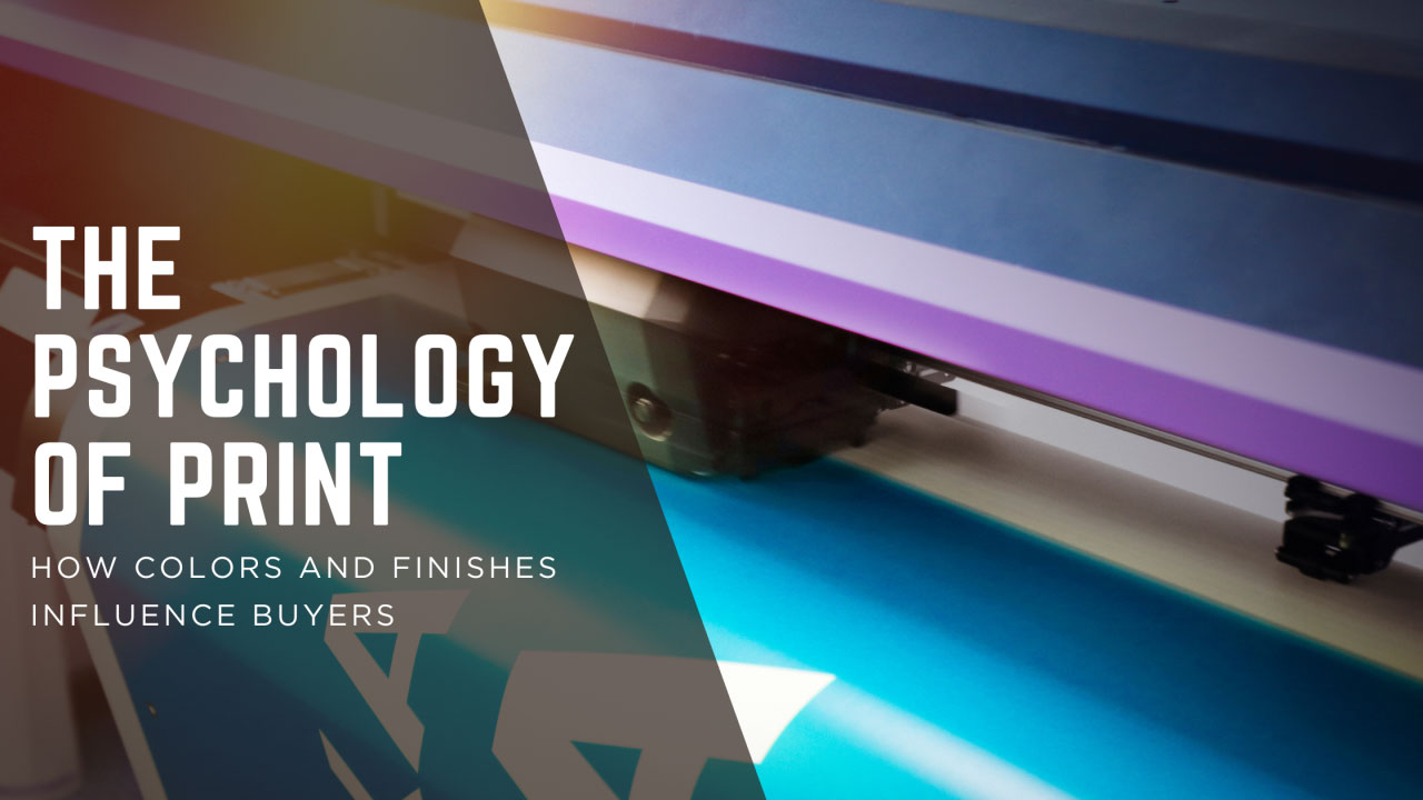
The Psychology of Color in Print
Color isn’t just decoration; it’s communication. Each shade tells a story and sparks an emotion.
- Red → urgency, energy, passion. Perfect for promotions, sales flyers, or call-to-action postcards.
- Blue → trust, stability, professionalism. Ideal for corporate brochures or healthcare communications.
- Green → growth, sustainability, balance. A go-to for eco-friendly brands and financial institutions.
- Yellow → optimism, warmth, attention-grabbing. Works well for highlighting offers or drawing eyes to key details.
- Black → sophistication, authority, luxury. Often used in premium packaging and high-end product catalogs.
Pro Tip: Use color intentionally. A luxury brand might pair black with gold foil for prestige, while a playful brand could lean into bright, bold palettes to spark excitement.
The Role of Finishes: Adding Texture & Impact
If color speaks to the eye, finishes speak to the hand—and the brain responds. Studies show that tactile experiences improve memory recall, which means the feel of your printed piece can influence how well customers remember your brand.
- Gloss Finish → sleek, modern, and eye-catching. Great for photos and marketing materials where vibrancy matters.
- Matte Finish → subtle, sophisticated, and smooth. Perfect for upscale brochures or business cards where elegance counts.
- Spot UV Coating → draws attention to specific elements like a logo or tagline, making them pop.
- Embossing/Debossing → creates a tactile impression that elevates a brand’s perceived value.
- Foil Stamping → metallic finishes that suggest luxury and exclusivity.
Example: A fundraising gala invitation with embossed lettering and gold foil won’t just be read—it’ll be kept.
Why This Works: Tying Design to Results
When customers hold a beautifully printed piece in their hands, they’re engaging multiple senses at once. This sensory experience:
- Increases brand recall.
- Signals quality and credibility.
- Creates an emotional connection.
In fact, research from neuromarketing studies shows that people process print materials with deeper emotional engagement than digital ads. That emotional response translates into action—whether that’s making a purchase, attending an event, or calling your business.
How to Use This for Your Next Project
- Define the emotion you want your piece to evoke. (Trust? Excitement? Exclusivity?)
- Select a color palette that supports that emotion.
- Choose finishes that align with your brand identity and audience expectations.
- Test and refine—sometimes the smallest change in finish or color can shift perception.
Final Thought
At Perfect Communications, we believe print isn’t just ink on paper—it’s an experience. By understanding the psychology of color and finishes, you can transform ordinary print pieces into powerful tools that inspire, persuade, and convert.
Ready to bring your brand’s story to life? Let’s talk about your next print project.
Leave a Reply