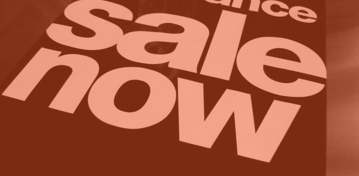
However, when designing effective signage, particularly for a retail environment, the following must be considered:
• Understand the audience: As with most communication vehicles, identifying the target market, their needs and your unique ability to address those needs is the first step is designing visuals and messages. The challenge with signage is the limited space to communicate your message. So messaging on signage must really hit the mark when speaking to the needs of the customer.
Think about shoppers in a retail environment. There are many distractions in the store including their cell phone, children, etc. Retail signage must cut through clutter and make the information needed easily accessible.
• Keep it visible and legible: Less really is more. By keeping your message short, your sign is easier to see and read at a glance. Visibility is the most important part of your signage. The use of color (type, background and foreground), fonts and images should also be selected to improve visibility. Red is an effective color in signage.
• Keep it simple: Successful signage communicates a message concisely. The message should be conveyed in as few words as possible to your target audience.
• Placement is critical: Understanding traffic patterns of your target audience needs to be researched. The most effective sign is of no use if your target doesn’t see it.
Do you have any additional tips on how to create effective signage? Let us know at marketing@perfectprinting.com.
Learn more about our Wide Format and Specialty Imaging Capabilities for environmental and retail signage at www.perfectprinting.com/capabilities#wide-format


Leave a Reply