Thought Leadership

    Creating Connections with Purposeful Event Signage

    1024 504 admin

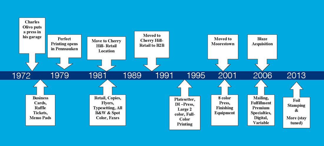
    In our nearly 35 year history we have printed thousands of these signs, an experience that has provided us with a great amount of insight as to what may or may not be important when joomla_4eloping useful and purposeful signage. However, we seldom have the opportunity to gain insight from the end users, the decision makers who are ultimately responsible for overseeing these events so we reached out to some friends for some perspective.

    The following three questions were posed to two industry experts, Lindsay, an executive director of a large national nonprofit and Mary, an accomplished meeting manager who is responsible for a large, annual national meeting (4,000 attendees) as well as an international meeting (respectively).  In addition we reached out to one of our favorite designers, Jacey of  Ten Eleven Design, to gain some insight on her perspective.

    Question: when you are contemplating a design project how much thought is given to the attendee’s experience / engagement? Meaning, are you thinking about how they will interact with your piece and how much thought is given to creating an attractive piece?  I’m sure equal weight is given to both but what I’m after is the struggle you face, as a designer, in creating an active piece that is also functional yet in many cases disposable.

    Jacey (Designer): When designing signage for conferences or events, I always begin with the event space. I gather information on how people will navigate the space, locations of messages and signs, timing of when people will receive information, etc. From there, I can make choices about conceptual design. I don’t really think too much about how temporary the design unless the client specifically wants to reuse the signs or hardware. My motivation is more about creating an experience for people, even if it’s temporary one. I also love exploring opportunities to recycle or upcycle used event materials and hope there is more of a demand for that in the future.  

    Question: When considering signage for a meeting what are the two or three most important elements that you think will define success?

    Mary (Meeting Manager): Branding, branding, branding. You need your sign clearly branded with discernible graphics related to the meeting and / or the association’s logo or theme. Well branded signs create connections with attendees, make them feel a part of the experience and generate enthusiasm in non-traditional spaces such as escalators, elevators and lounges (fun place).

    Lindsay (Executive Director): I look for high quality that can be used again. It’s important to me to be green so I don’t like to have single use signs. I prefer to make an investment on the front-end and to re-use over and over.

    Question: Given the nature of today’s ultra-creative and visual environment how loose (fun, free, crazy) can we be with having fun with the creativity of directional or other signage?

    Mary: Signage has a clear purpose in the delivery of information – they need to be clear and concise so attendees get the information they need quickly and in a meaningful way. Fun is okay but it’s important not to lose sight of the purpose of the sign.

    Lindsay: Fun is fine but I prefer simplicity with minimal text. People are busy so the signage should help attendees feel welcome and communicate necessary information.

    Question: How closely do you work with the design team when creating event signage?

    Mary: Very closely – I need to be involved from beginning to end to ensure that messaging and design reflect the brand. Branding, branding, branding.

    Lindsay: Cost is important. Nonprofits run on tight budgets so while design is good, cost must be factored.

    As the team that sits squarely within the nexus of creativity, production and delivery it’s fascinating to learn what’s important to those responsible for ensuring what we produce meets their expectations. In many cases, signage can make or break a meeting or be the difference between a frustrated attendee and one that arrives to their sessions on time. After all, there’s a reason GPS is so popular…we love to know where we’re going and hate it when we can’t find our way.  

    A big thank you to our contributing experts!


    photo credit: http://www.thinkinc.com/blog/think-attends-forrester-consumer-forum-conference-in-chicago/


    A Print Job Gone Bad

    731 411 admin

    It seems that the newly designed bills were printed with too much ink and the lines in the very detailed artwork were hard to distinguish. The new $100 bills will feature 3D images and a chameleon like Liberty Bell, designed with the intent to thwart counterfeiters across the globe.

    While much has been made about the commoditization of print, this error brings to attention that there is still a crafts-like aspect to printing and no amount of automation can fully replace the need for experienced, detail oriented press operators to see that the job is printed as designed. As far as the “bad” money, I am sure that there will be no lack of volunteers that would be willing to take it off of the government’s hands. I feel sympathy for the poor employee who will be tasked with destroying $30 million dollars.

    Keep Calm and Print On

    1024 504 admin

    Beginning in the mid-1980’s thru the 1990’s the printing industry began to feel the impact of an industry-wide transformation. The invention of the Mac and its impact on image setting, the arrival and widespread use of email, and the emergence of electronic media caused great pause within our community.

    As the world celebrated the turn of the century the printing industry continued to scratch its collective head and wonder where the future was headed. Unfortunately it took only a few years until the industry would sustain another blow. The recession of 2008-2009 reduced the number of U.S. printers from 36,508 to 33,565, a drop of 8%, taking nearly 70,000 jobs with it. Production was impacted and the future of print was once again shrouded in cloud of doubt. Simultaneously, the eruption of social media and image-driven social platforms have caused additional pause to the printing industry as the way we communicate and the methods by which communications continue to evolve.

    However, the printing industry continues to press on. In the face of all of the challenges faced over the past several years a few truths remain intact…print remains the only form of communication to occupy physical space, print creates a unique and tangible experience, and printers continues to evolve and embrace new technology and design to remain relevant.  Consider for a moment that 76% of businesses state that their ideal marketing mix is a combination of print and digital.

    Last week our team created this poster in an effort to embrace our expertise, share our philosophy, demonstrate our pride, pay tribute to our tradition and…well, to keep calm and print on.


    To learn more about the origins of the phrase please check out the following post: http://bizeez.com/keep_calm_and_carry_on/

    To learn more about the impact of the recession on the printing industry please see: http://www.piasc.org/pdf/business/MovingPastTheGreatRecession.pdf

    To learn more about how print is an essential piece in the marketing mix even in the digital age see http://www.printinthemix.org


    Fundraising for Higher Education Institutions

    1024 504 admin

    Some of the best practices in creating a donor appeal campaign includes segmenting the target audience into New Grads, New Grad Renewals and Regular Renewals. The direct mail piece can be versioned for these segments. If an offer is part of the campaign, this too can be versioned among the intended recipients. For instance, more recent grads can receive an offer of an ITunes gift card, while older graduates can be given a premium item of greater value that is reflective of their past giving amounts. This can all be communicated on the direct mail piece. The mailers can be further segmented into age, gender, degree and geographical groups as well. All of this data is usually readily available to an organization.

    With the proper segmentation, personalized direct mail can increase acquisition and retention rates and ultimately go a long way towards meeting the fundraising goals of any academic institution.


    The Payoff of Personalization

    1024 504 admin

    One thing that an organization may want to try is the introduction of variable data into the newsletter to see if this can breathe life into an underperforming asset. You may have heard the phrase, variable data, but what does it really mean?  Variable data printing is a form of digital printing in which elements such as text, graphics and images may be changed from one printed piece to the next, without stopping or slowing down the printing process and using information from a database.  It’s more than adding a name or address, it’s a personalization process that enhances communication. 

    The biggest overall use of personalization within member based associations is the ability to vary communications dependent on the primary reason why a member belongs to an association. Members often join associations for reasons that vary from networking, education, government advocacy and/or access to group benefits.  Some other uses are:

    • Using personalization in  communications based on a members previous use of association resources
    • The use of variable print to increase member interaction at member events (i.e. personalized networking cards, name badges, or event registration forms)
    • Using personalized url’s (purl’s) to pre-populate member surveys which will increase participation
    • Using variable data when requesting a member’s participation in legislative call to actions and legislative communications (i.e. printing the name and contact information of the appropriate Congressman for the recipient)
    • Using variable data when sending out dues renewal information (the previous year’s payment history can be communicated)
    • Using personalization to vary printed communications between long time members, reconnecting with past members who have dropped off  and prospective members

    Introducing a full variable data newsletter to your entire database may seem overwhelming and, at first glance, more costly than a conventional newsletter.  A suggestion would be to test the introduction of the variable data. One way to do this would be to print half of the newsletters as a static version and the other half as a personalized newsletter.  Adding varying levels of personalization is also a way that one can test the waters of personalization versus response rates. If you feel your organization lacks the necessary data to add personalization to its direct mail efforts, doing a test mailing is one of the best ways to kick start your efforts.

    Contact us if you have any stories about how variable data has worked for you or if you are interested in learning more about this personalization process can help your organization.


    How Theater Companies Use Variable Data for Membership Campaigns

    1024 504 admin

    Personalization can, and should be, more than just the use of the recipient’s name throughout mailer.  Data fields, blocks of copy and  images can all be variable or unique to each individual piece.

    Following are some suggested uses of personalization based on a direct mail campaign for subscription renewal.

    • Use personalization to version the piece between renewal donors (those who have made a donation in the previous 12 months), acquisition donors (those who have made a donation previously but not in the past 12 months) and non-donors (those who not have never made a donation)
    •  Use subscriber’s previous season ticket information to map their seat information for easy removal. (i.e. number of subscriptions, seating locations, ticket prices)
    •  Use color coding to point recipients in the right direction.
    • Vary the suggested donation amount dependent upon previous donations.
    •  Print a different message dependent upon the targeted group.
    • Utilize a personalized url (purl) to pre-populate a landing page for those who reply online.

    Using personalization in the proper manner can remove or minimize the friction involved with renewal or donor requests and ultimately increase the response rate , hopefully increasing  the incoming revenue to the organization.


    How Choice of Media Impacts Design

    1024 504 admin

    Consumers and businesses alike are being bombarded with content.   An argument can be made that they suffer from digital fatigue.  With the dizzying array of marketing channels now available and the explosion of digital and social as media, companies are scrambling to learn new forms of communication often at the expense of presentation. In other words, the medium becomes more important than messaging.

    As I step back and look at communications trends in business, I see marketers quickly scrambling to learn new technologies sometimes at the expense of basic principles of marketing. Fear of irrelevance in terms of digital parlance has made many irrelevant to their core audiences. Simply put, content is there, but it stinks. Has anyone scanned a QR code lately?

    Regardless if the medium is paper or digital, it is still important to ask the following questions in order to cut through clutter and engage your audience:

    -Have the fundamental elements of good design changed? (Am I employing good design?)

    -Have the fundamental principles of marketing changed? (Is my offer valuable to my audience?)

    -Has our visual interpretation changed? (Do they understand me?)

    While the methods of delivery are almost too numerous to count, the goals and basic principles typically remain unaltered.  Excellent design, a timely offer and a message that leads me to believe my needs will be met will be remembered, even amidst the clutter.

    Playing Moneyball with Your Marketing

    717 422 admin

    For those of us with tight marketing budgets, this movie can serve as a reminder of the things that we can do to improve our campaigns and compete against larger organizations that have bigger budgets. As in the movie, the key is analyzing the data and looking for pieces that can be an indicator of success or failure. Finding failure in a campaign is not necessarily a failure in and of itself. It allows you to not repeat the same mistake in future campaigns.

    During the movie, the A’s identify two factors (on-base percentage and slugging percentage) that they feel are better indicators of long term offensive success. By doing this they go against the common wisdom of baseball insiders with years of experience. Success in a marketing campaign can be achieved in the same way. Searching the data with a fresh perspective may allow you to gain insights that can translate into long-term success for future campaigns.


    Go Ahead, Print that Email!

    1024 504 admin

    Paper is a biodegradable, renewable, recyclable and sustainable product made from trees.  Trees are a harvestable crop, no different than wheat or corn and vital to the American economy as well as the environment.  Not printing that email does absolutely nothing to save the planet or forests.  Think of the impact if everyone did the same!